
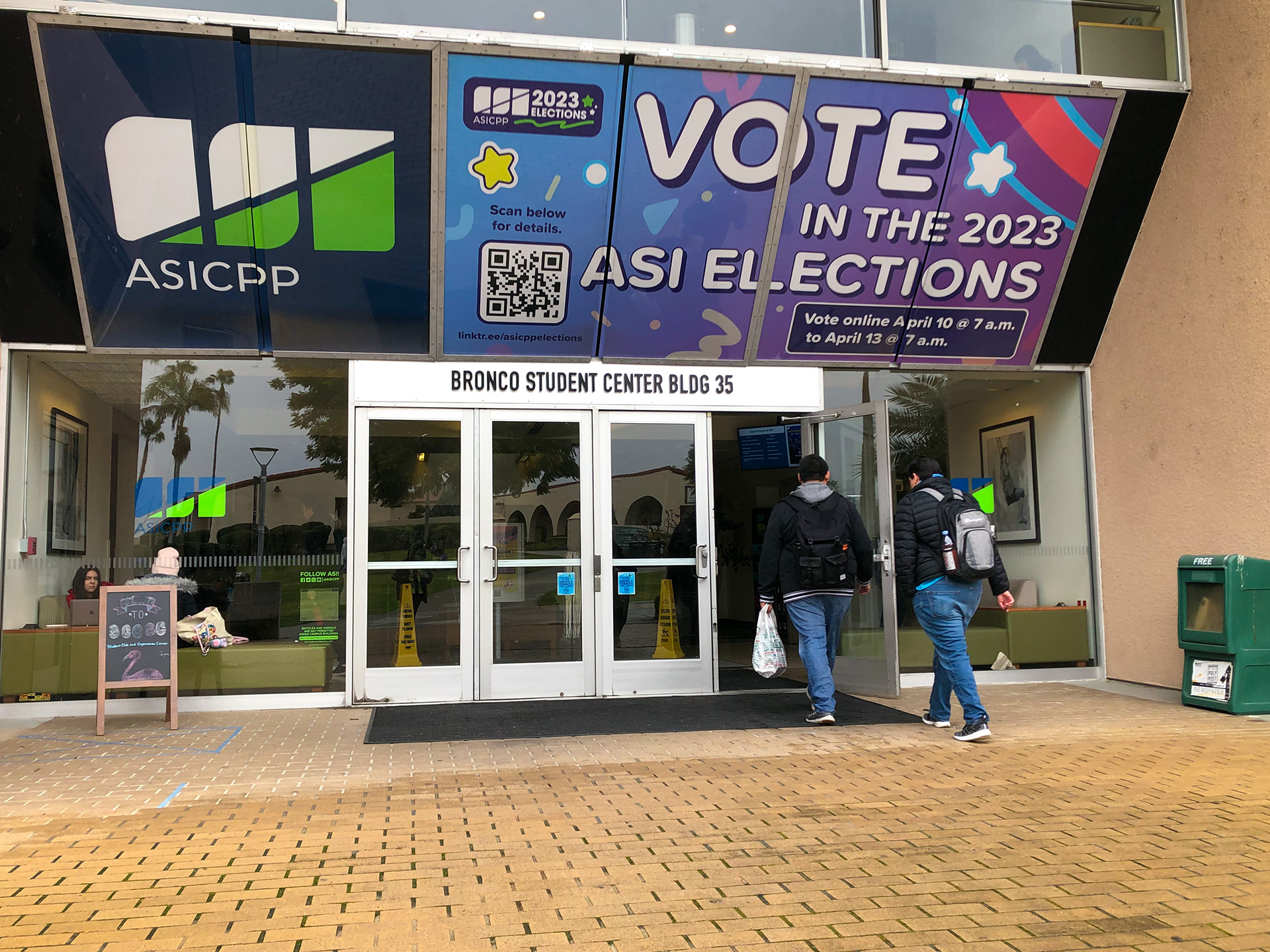
As winter semester was winding down, the annual ASI elections were drawing near, and you could feel the excitement buzzing through the air.
Like most colleges across the U.S, Cal Poly Pomona has a student council that is run through the Student Government department within Associated Students, Inc and holds a campaign each year to elect new student representatives. I was very interested in participating in this campaign because I wanted to learn more about the process involved in designing for a large marketing project.
“Large project” might be an understatement…
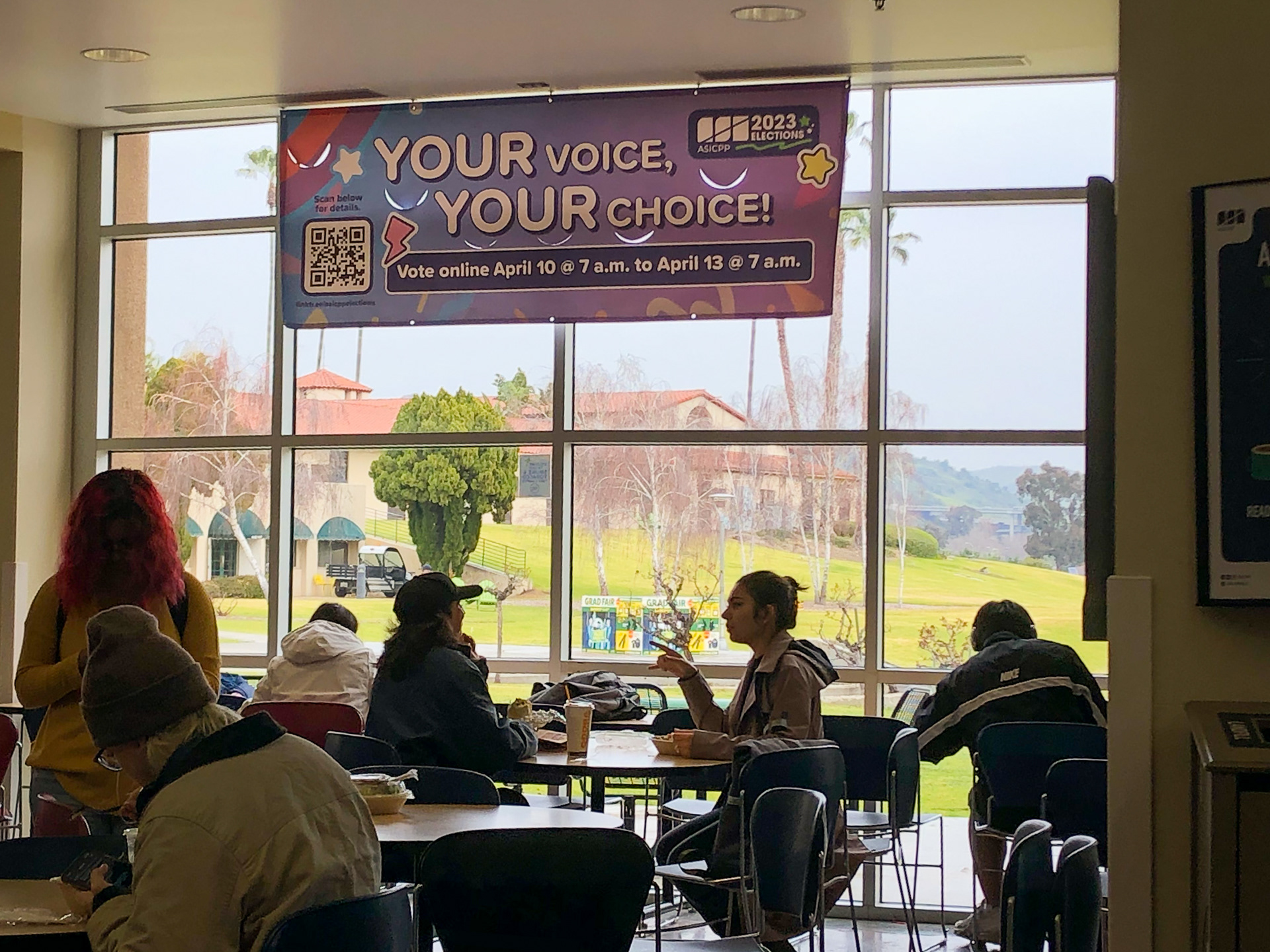
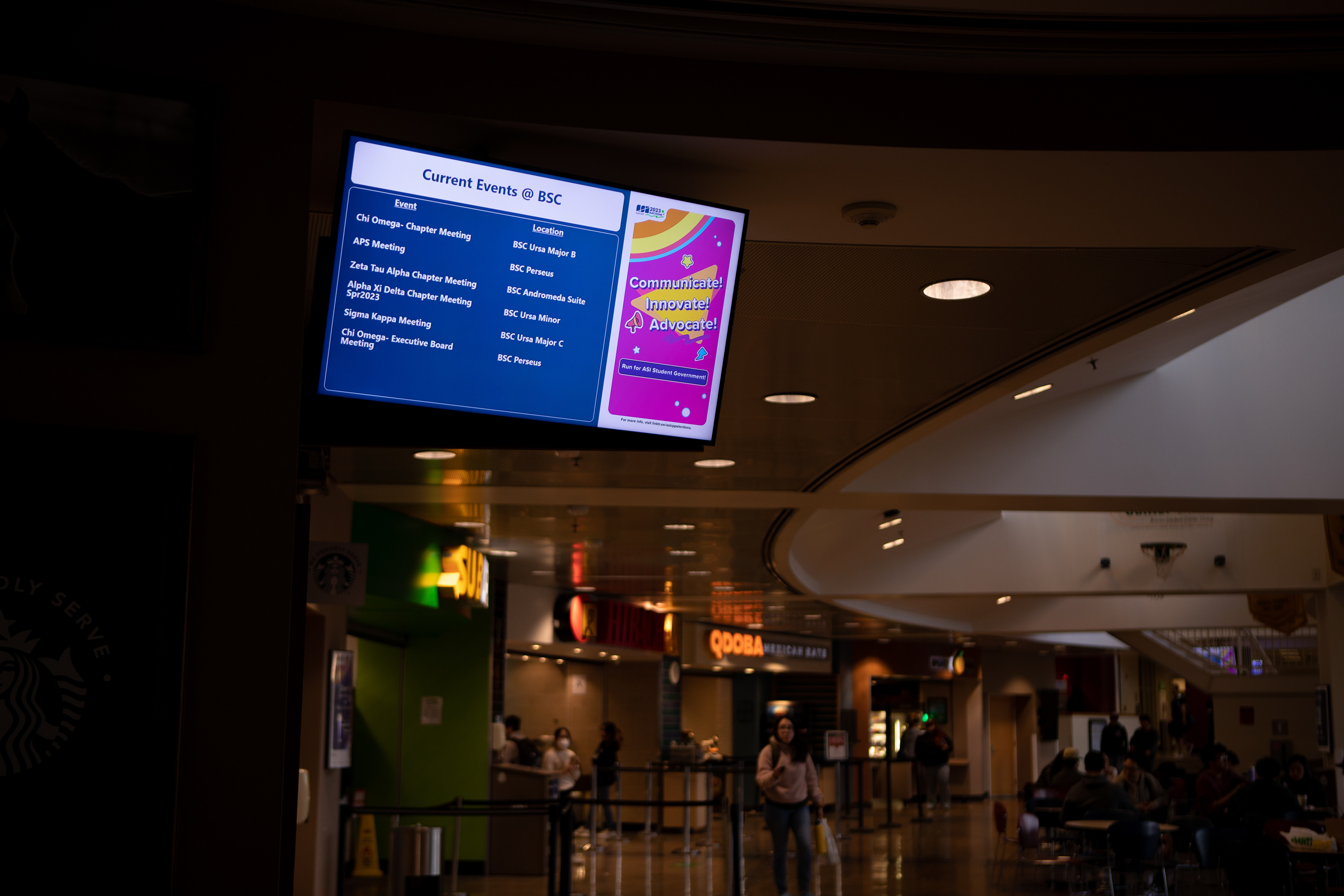
The ASI Elections are marketed to the 25,000+ student electorate, asking them to sign up to run for the position of ASI president, vice president, and representative of each college under CPP. Candidates are given time to campaign, and then voting takes place near the end of the semester. The entire election cycle requires extensive marketing to increase student awareness and engage them to participate and vote for their peers.
Starting from the ground up
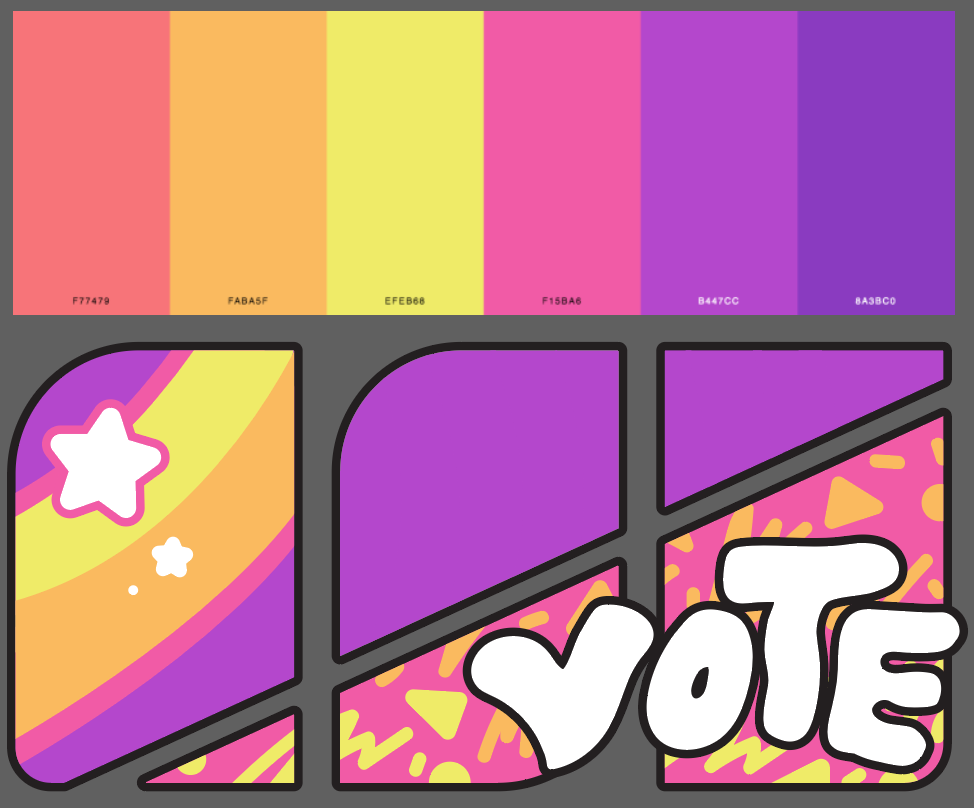
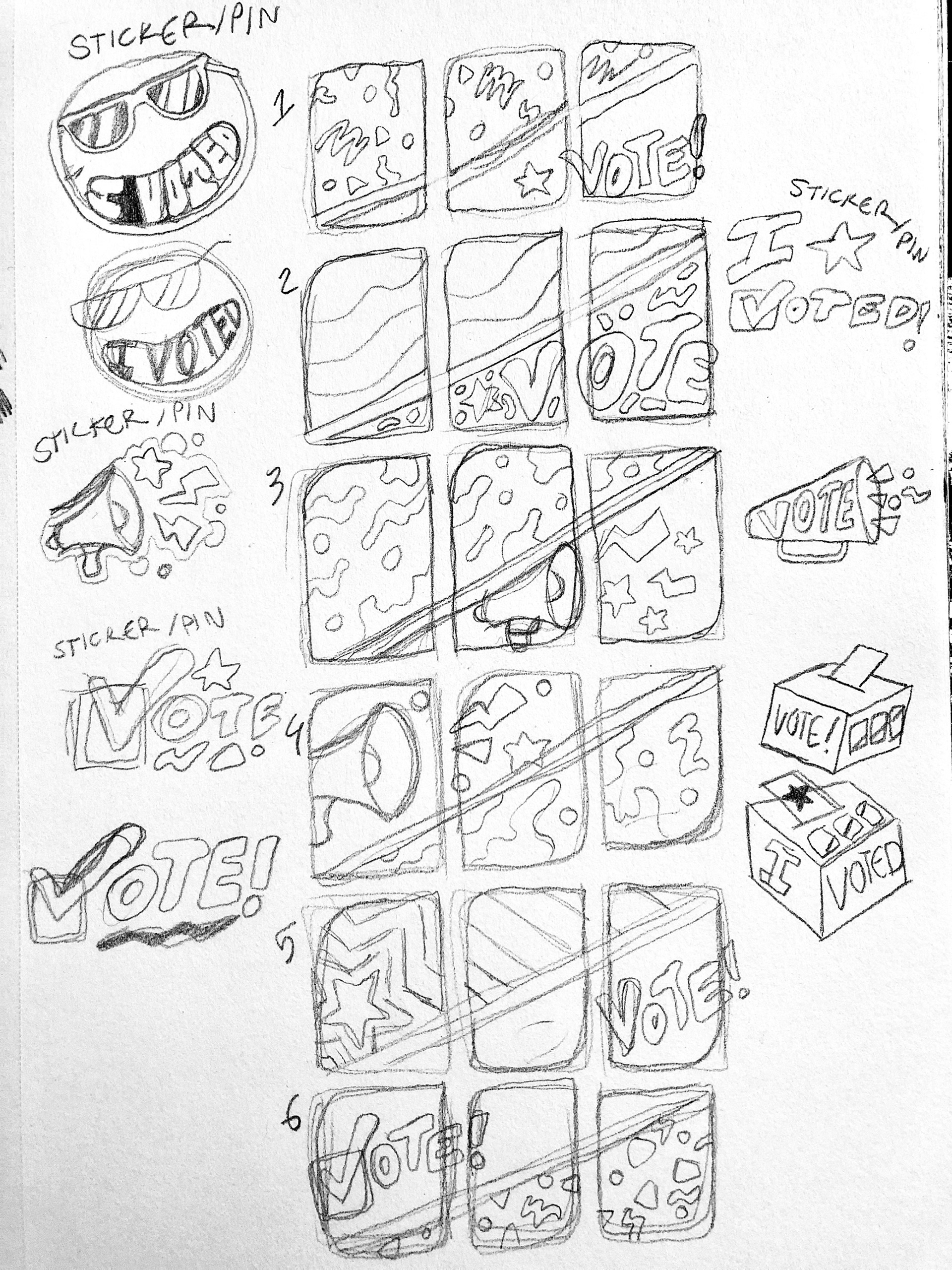
The designs used for previous ASI elections, while well-executed, followed traditional “election” themed designs (stars and stripes, etc.) and were too formulaic to repurpose for this years’ campaign. We decided that the best way to grab the attention of our peers would have to be original and fun.
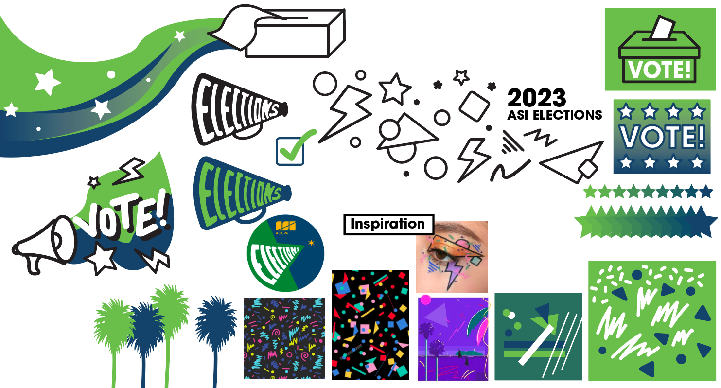
Adding more fun to the ASI elections
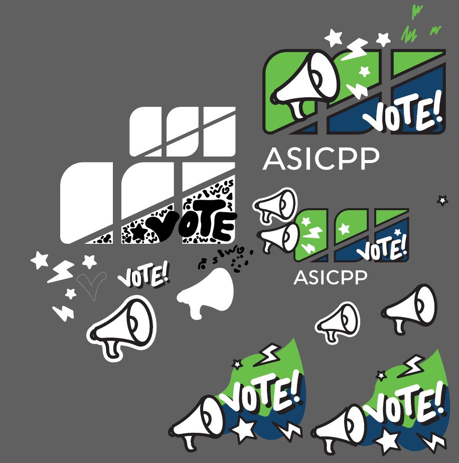
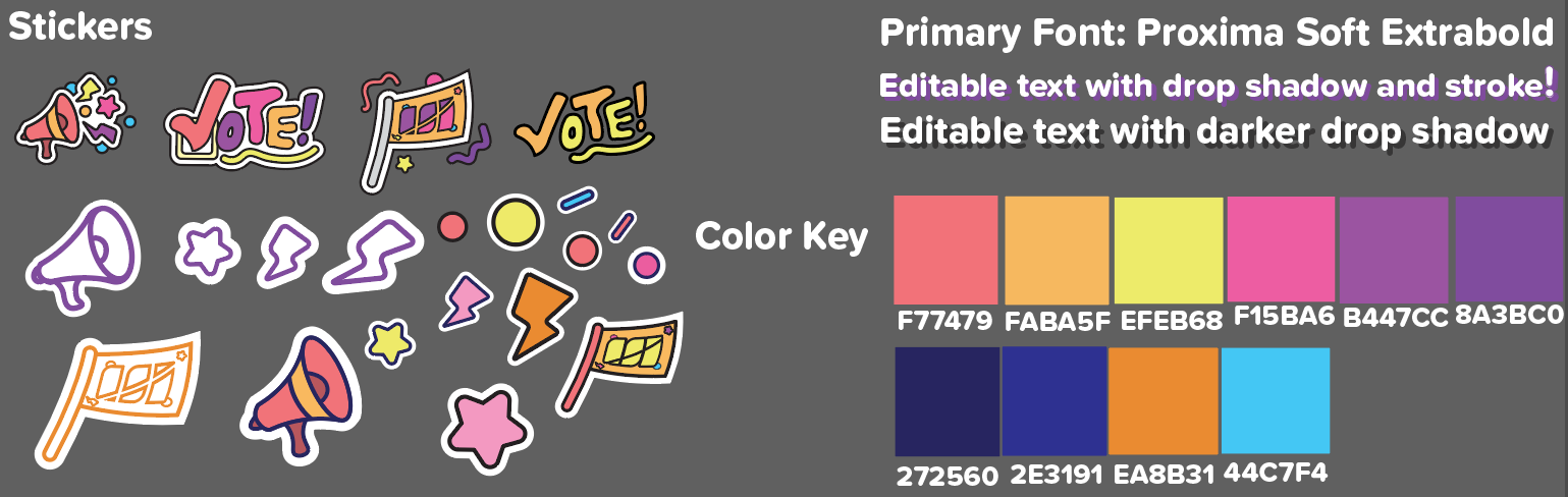
We created concept sketches and a moodboard centered around the concept of what I like to call “Lisa Frank meets MTV”. We chose neon colors reminiscent of the 1980’s and 90’s to dominate the color palette, and came up with plenty of confetti-like assets that we lovingly referred to as “sprinkles”. We came up with this theme because we wanted to engage students with a fresh, vibrant and fun aesthetic that was completely unique from previous elections.
Phasing our way through the campaign
The campaign required not only deliverables for all of ASI’s social media platforms and campus presences, but different layouts for all of the milestones during the elections. To make these milestones more discernible, we split the entire campaign into 3 phases; candidate applications, candidate campaigning, and the final elections week when the voting took place.
Splitting up the work and crushing the deadlines
While splitting the campaign into 3 phases made the deadlines easier to discern, there was still a mountain of design goals to meet. Quinn and I reached out to our whole design team, and we were able to divide the work equally amongst everyone.
Since we had created over 150 deliverables covering all 3 phases of the campaign, we were able to market the campaign on an unparalleled level compared to previous election years.
A marketing blast-off!
Overwhelming participation from students
Our marketing campaign was a resounding success; 6 pairs of president and vice president candidates signed up for the race, compared to the usual 2 or 3 pairs in recent years. By the time voting was over, there had been such a high voter turnout that the race between ASI president was tied and needed a runoff vote to break the tie! The results of the election felt so rewarding to our team, especially because we took a leap of faith in making the design theme unique and vibrant. The nostalgic and fun designs encouraged participation and highlighted the importance of making designs relatable to the target audience to guarantee success.