
This brewery needed two mascots for their debut line of products that matched the feeling of “strange Portland magic” that their company centers themselves around. To make the designs stand out, I repurposed some hand-drawn illustrations I’ve made a couple of years ago that matched the feeling they needed on their product labels.
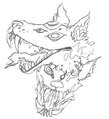
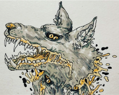
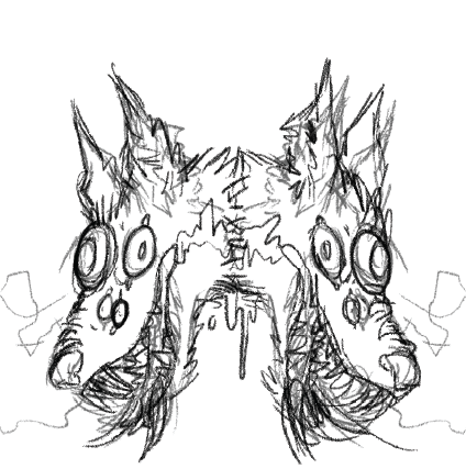
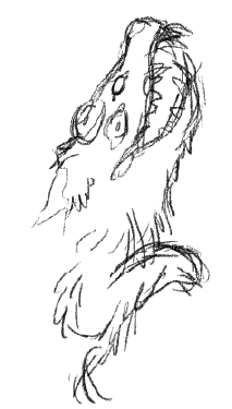
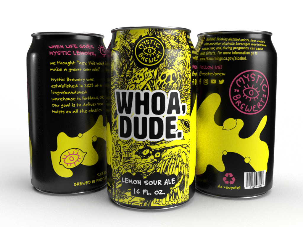
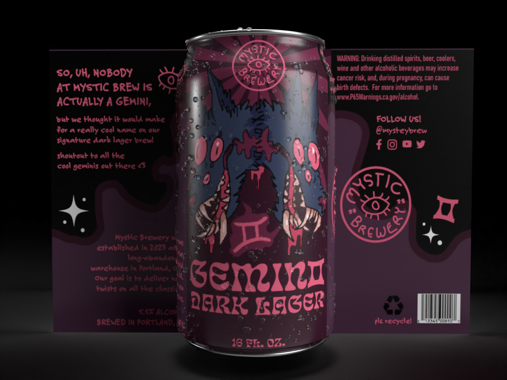
The overall tone of both designs emulate the “Keep Portland Weird” attitudes of the brewery’s hometown. Dark and moody colors are contrasted by bright, warm tones that pay homage to the grafitti that covers many surfaces in Portland. The toothy, twisted creatures present in both can designs compliment the color scheme’s mood.